Monday, November 28, 2011

Post #9 Reflection

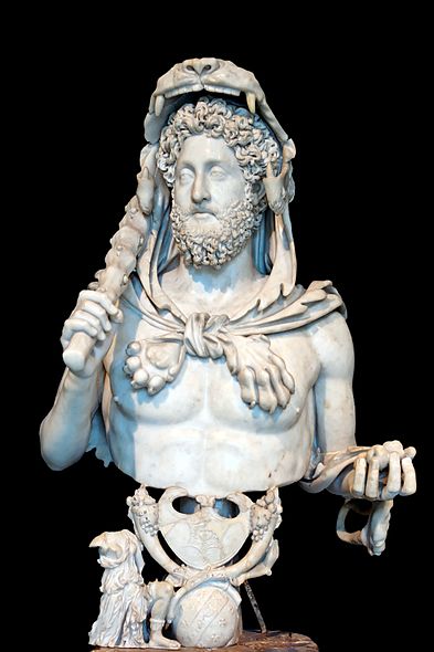
I really enjoyed learning about both Greek and Estrucan art this quarter. Greek history was something that I have always been interested in and studied a lot during school, so I was interested in actually learning about the artwork for the period. Estrucan art on the other hand is something that was totally new for me, all I had learned about the Estrucans was that they were the predecessors to the Romans, but did not know anything about their history or artwork. In school we had always gone over the Greeks and moved straight into the Romans barely even mentioning the Estrucans. Learning about Estrucan art gives me a better understanding of their culture but also serves as a bridge between Greek and Roman art.


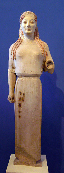
Specifically in Greek art, I enjoyed the new viewpoint I gained about the actual appearance of Greek art. The idea that Greek art was plain and simple was a viewpoint I had always held, but this was shattered. The “Peplos” Kore really illustrates what color can do for the piece. My reaction to the piece is totally different in its form of color. The premade idea I had of Greek art turned out to be untrue, and I even felt a little uneasy with the colored Greek pieces. The same came with the piece depicting the archer. Looking at the plain form, I would have said it looks like a perfect example of simplified Greek art. However, taking a look at the reconstruction, I am greeted with a mass of colors which throw off my interpretation of the piece all together. The initial reaction of the use of color is off putting to me, it takes a bit to process and analyze. The discussion of Wincklemann and his promotion of pure and simple Greek art helped with the accepting of the colored pieces. I actually got a little mad with the result of Wincklemann altering my understanding of Greek art to actually be false.  It was nice to be able to learn about how Greek art really was, not just the interpretation of what it should be.

Etruscan art on the other hand was something I had known nothing about coming into this class, so I was interested to see what it was all about. The most interesting part of Etruscan artwork I found was the change in tone which occurred in tombs. For example, the tomb of hunting and fishing depicts a very upbeat outlook. It consists of a very naturalistic viewpoint; it was interesting to see how quickly this outlook changed. The “tomb of the blue demons” sheds light on this change presenting a very different outlook. The artwork seems very dark, and I was surprised to see forms of demons and serpents present. The relation to these changed in the pieces of artwork and the downfall of the Estrucans was something I found very interesting. I liked the fact that with time the artwork even changed with the climate the culture was in. Another piece of Etruscan art which really caught my eye was the “Tomb of Reliefs”. The amount of detail use with all of the tools and items painted or carved into the tomb is pretty surprising.  It seems to be very thorough with having all the necessities present for one to bring to the afterlife. It even reminded me of Egyptian pyramids, and all of the material sent with one to the afterlife. Overall I found Etruscan art very unique with its tombs, not only with the detail but also the tone of the artwork that changed. 

Tuesday, November 15, 2011

Byzantine and Early Medieval Art Option 1

Taking a look at Byzantine and Medieval art, there is a big discrepancy with regards to naturalism than what was seen in Greek or Roman art. I find this to be interesting because in time, one would think that abilities improve, so naturalism would improve, but that does not happen here.
                The first piece that I think illustrates this difference is the “Presentation page with Abbess Hitda and St. Walpurga” located on page 450. The lack of naturalism becomes clear very early with looking at the size of the two people in the image in relation to the buildings. Another part, the center character has his head outlined with a gold flat halo, which is more symbolism than who one would actually appear. The figures also have a black outline, this outlines is used for physical features along with outlining their cloths. The use of line in place of actual features was not used in Greek art and is not a naturalistic trait. There is no sense of physical form or features present, Greek and Roman art emphasized the physical form and muscles. In this piece, the people are covered from head to toe in very loosely fitting clothing reflecting no physical features at all. On top of this, their appendages do not match their bodies. Both figures have abnormally small hands and feet compared to the rest of their body. What is interesting about that, the character on the left, despite having small hands, has abnormally long figures. There seems to be a lack of caring when it comes to correctly adding proportions to the characters. It is also clear that like medieval and Byzantine art, the figures are elongated abnormally in this figure. The distance between their feet and their waste is not naturalistic at all. Overall, I get the sense that the content of the piece takes precedent in making the figures look natural.            
                Another image which adds to the idea that medieval art stepped away from naturalism is the “Matthew writing his gospel” on page 431. Although not as blatant as the first one, there are some aspects of the people in this piece which really go away from naturalistic works. First is the existence of the halos like in the work before, used in more of a symbolic form than natural looking. Onto of this, all of the figures use outline and lines to represent their features. For example, Matthew’s beard and hair, does not look natural at all. Instead, it is stylized using lines of different colors; I do not know one man who has colored lines like that for hair. Also, his body parts seem unnatural, his feet are awkwardly lines up one behind another, it actually reminds me a little of Egyptian art. I also see this with his hands; this second hand which rests on the bible seems to just disappear off into mid air, normally one would see the arm continue in some fashion. Although not as evident at the other work, this form seems to be also elongated, longer than a person normally would be. The clothing is also used to really hide a lot of the physical characteristic. Like the previous work,  it appears that emphasis is placed on the subject matter and story told rather than representing people naturalistically. 

Monday, November 7, 2011

Commodus and Caracalla


The pieces featured Commodus as Hercules and the head of Caracalla are similar however provides some distinct differences that help to visualize how the rules portray themselves. The bust of Commodus as Hercules is made from marble in typical roman fashion. In the message, Commodus seems to not rely on himself to appear great, but has to relate himself to being a descendent of the gods in the form of Hercules. He is depicted very ornately featuring almost perfect features and muscles, armed with a club, apples, and a lion’s fur, with distance hair and beard. It seems like he is trying to get the viewers of this piece to relate his image with that of Hercules, however, now days we do not have a good idea of what Hercules looks like, so to us, it just looks like Commodus is going to great lengths to add to his appearance. The bust uses light to its advantage with the use of the lions head as a hood; it focuses the eyes on Commodus’s face. Overall the image tried to depict Commodus as a worthy ruler that can be related to the gods, signifying that Commodus has divine backing, because he has relation to Hercules.


                The head of Caracalla, a bust as well, serves a use of propaganda but not in the form of presenting himself to be godly or appear to be someone he is not.  Just like the bust of Commodus, this is made out of marble and is a piece of propaganda. This however, is where the similarities end. The head of Caracalla does not show humans in their perfect form like the bust of Commodus as Hercules does. Instead, Caracalla has lines in his forehead, and a very stern brow. He presents staring eyes, with an almost frown upon his face. Along with this, his beard and hair are very short and barely visible unlike Commodus who has very curly hair and beard. This piece portrays Caracalla as a very serious ruler, just looking at his face a viewer can tell that he is not easy going and has a lot of concern in his face. This is unlike Commodus, who seems to have a very perfect, neutral expression. Someone looking at this piece from this time period would be able to relate the face with the struggles the empire is facing at the time and know that Caracalla, the stern looking ruler takes things seriously, unlike Commodus who is just playing dress up. Even looking back today, not knowing the time period or Caracalla by appearance, we can discern that he is indeed a serious man. Looking at his face, it might even give the viewer a sense of fear if against this man, or a sense of safety knowing that he is in control. His serious expression is even added upon with the use of lighting with the darkness on the right side of his face and the darkness above these eyes. Looking at these pieces, one gets the sense of the periods they lived in relation to the Roman Empire. Commodus, coming out of the height of the empire, is carefree, and able to portray himself as whatever he wishes in perfect form. While Caracalla has a more simple serious representation of himself, with no time to or need to represent him as anything different.

Monday, October 31, 2011

The Pantheons Missing Marbles.


The location of the Parthenon Marbles in London does not surprise me. From what we have studies, with how old certain pieces of art are, the land that they exist on change hands quite a bit. Taking a look at the Ishtar Gates for example, this was originally in Babylon, ended up in Germany.  The final placement of art seems to relate to the history of its location. A museum such as the Louvre would not be as grand as it is if art did not get taken from their original locations.  This was seen with near eastern art as well, such as the Stele of NaramSin which was stolen and defaced in time.  In this case, the Turks, did not seem to value the history behind the Pantheon, using it for military purposes, and easily gave the marbles to Thomas Bruce.
                I do not like the idea of taking a piece of art out of its original context. These pieces were taken to study in an artificial environment. Yes this did allow many students to view and draw the marble sculptures, but besides their physical characteristics, what do the students get out of it?  They do get to admire different pieces up close which would not normally be at eye level. There is always a context to a piece of work and this is missing when they are taken out of the original location. The Elgin marbles were used to tell a story, many pierces to a great structure. I also do not like the fact that the reason for the moving of the marbles is because Lord Elgin wanted to decorate his house. We are talking about priceless statues which were a part of a larger temple. They are not stand alone pierces that should be used for decoration. Is the cost of being able to look at the marbles up close worth losing the background and purpose of the pieces? I do not think so, the historical context and purpose of the statues needs to be a part of the story.
                Although I do not see it ever happening, I do believe that the Pantheon marbles should return to Athens. The problem is ownership, the Turks who occupied the land did indeed give them to the British and the Greeks will have a hard time getting around this. In a perfect world, I would like them to be returned to the location of the Pantheon in Athens to be a part of a larger historical site. Although I do not think it is possible for them to return to their original location apart of the Pantheon, at least being at the sight will allow them to present some historical context, and relate them to the actual structure they were a part of. I think it would be really beneficial to apart of this exhibit, create images of how they would have looked in their original format. This way, they would be in the correct location, and visitors would be able to get a better sense of how Greek art really was, and witness the story the art tells rather than the individual separated figures. 

Monday, October 17, 2011

Post 4: Unknown Aegean Art


The unknown vase looks pretty tough to decipher which culture it came from but there are some characteristics of it which help move me in a particular direction. At first glance, it appears to have been made on a potter’s wheel, but all three cultures did that as well. The first culture I would exclude this from being is the Cycladic people. Based on the Kamares Ware jug on page 86, the designs are pretty different; the vase is depicting specific things with registers while the Kamares jug looks to be pretty abstract and simplified like Cycladic artwork. The Minoan culture could have made this based on the idea that it does depict nature in a way. I shy away from this though, taking a look at the Harvester Rhyton on page 89, it becomes clear that the Minoans use realistic depictions of people and show depth. This vase appears to be more in the form of cartoonish characters and everything is single file. This leaves me to believe that this vase is the work of the Mycenaean people. Bringing up the Warrior Krater on page 99, I can see some distinct similarities between the two. First, both use distinct registers at the top and bottom of the vase, although this seems to be pretty common amongst Aegean art. Although the vase does not depict a wartime scene like the Mycenaean tended to be, it seems to show more of a farming type scene. Being that the Mycenaean were based on mainland Greece, it does not seem odd that they could have been farmers too. Another point in relation to the Warrior Krater is the depiction of images with no depth, and in profile similar to how the soldiers have no depth. The images in the farm vase also seem to have a cartoonish outline to them, similar to the style of the soldiers in the Warrior Krater. Although it would be hard to pick, I would say the Mycenaean would be most likely to have created this vase.


The second image of the fisherman is also tough to place. Firstly all three Aegean cultures could have a relation with water in some way so geographically I so no help. Going down the list, I would first eliminate the Cycladic again based on the fact that this image looks to be more complex than most works such as the Figure of a Woman on page 82. Next I would exclude the Mycenaean due to the depiction of the human form. Using the Warrior Krater on page 99 as an example, humans are depicted non realistic and outlined while this image depicts a human more naturalistically. Based on that fact I would move onto the Minoans, who like the other two had a relation with water.  I really would like to think that this is a Minoan piece based on a few things. It is every humanistic and Minoan work such as the Harvester Rhyton appears to be realistic. It also incorporates part of the natural work, with the fish and that is something the Minoans are known for. Another thing similar to the Minoans is the incorporation of fish which is a sea creater. The Minoans seem to incorporate a lot to do with the ocean. Using the Flotilla Fresco on page 92, there seems to be pretty big similarities in the depiction of humans and sea creates in this image. 

Monday, October 10, 2011

Post 4: Pyramids and Ziggurats.


                Coming from a similar time period more than four thousand years ago, the pyramids of Giza and the near eastern ziggurats are both examples of monumental architecture. Both the pyramids and ziggurats are immense but have distinct differences when it comes to actual structure and purpose of the structures.
The physical structure of the Pyramids of Giza consists of four sloping faces which form a triangle. They are made of blocks which weigh in at 2.5 tons, which is massive when you think of people hand making the structure. The largest of the three pyramids, build for Khufu, consisted of a 13 acre base and raised to a height of 481 ft. This is massive, and visually someone would be able to see this from great distance. The original outer structure consisted of limestone with a golden cap, which would have glistened in the Egyptian sun. There seems to be a very specific mathematical calculation when it comes to the creation of the structures not only that, the placement with the sunset, seems to suggest that their placement was for a specific purpose.  
The ziggurats on the other hand, are massive hill like structures build in the near east. The ziggurat at Ur in particular consisted of a massive base almost 2/3 of a acre but when compared to the largest pyramid at Giza it seems small. The ziggurat rises to over 100 feet similar to the base, a huge number which would tower over everyone who gazes upon it, but significantly smaller than the largest pyramid at Giza as well. It consists of sets of stairs which ascend to the cella as the top. Similar to the Pyramids, it is a massive structure which would appear with a great distance. The ziggurat at Ur also has a slanted portion of it similar to the Pyramids; however the purpose of this seems to be related to rain runoff rather than actually serving a symbolic purpose. The slants at the Pyramids seem to serve to connect to the heavens. The ziggurats are built of a mud brick structure, with an earthly look to them but also are distinct with the stairs built up the temple on top. The Pyramids seems to be a part of a large complex while the ziggurat is a standalone structure.
The purposes of the structures were also very diverse. The pyramids served as a resting place for the dead pharos, the pyramid being a semi hallow structure which served as a tomb for the pharaoh to make their trip to the afterlife. The ziggurat however, was a solid internal structure and all of its purpose occurred on the outside as a place of worship. The large complex of the pyramids served the long journey of a body in a funeral procession and embalming to final burial then reunites the dead with the gods in the afterlife. The ziggurat would be a place where people would gather in life to worship gods. The ziggurat at Ur for example was dedicated to the moon god Nanna, the large structure served to get the people closer to the heavens. What is similar about the two when it comes to purpose is that both serve a major religious role in a polytheistic society.  

Monday, October 3, 2011

Formal Analysis: Assurnasirpal II Killing Lions


Post 3: Formal Analysis of Assurnasirpal II Killing Lion

The Assyrian pierce of ‘Assurnaspiral II Killing Lions’ really caught my eye with its portrayal of Assurnasirpal II as a very courage’s leader who is not afraid to face dangers and fight for his people. Your eye is immediately drawn to Assurnaspiral who is in the very center of this piece atop his chariot. On both sides of him are lions which he is slaying, this arrangement seems to give off the perception that he is surrounded by danger and singlehandedly can take care of it. Following his chariot are his guards who rally behind his lead, their arrangement behind Assurnaspiral gives him a sense of being a leader in this piece.
Most of the creatures or people in this piece are viewed in profile which seems to be a pretty common type for this time period. The exception to this is Assurnasirpal II who is actually in more of a composite stance with his head being in profile but his upper body to be facing the viewer. With king Assurnaspiral being the only person not in profile gives me the impression that he is meant to be the focus of the piece, standing different from the rest of the characters. It almost gives the impression that he stands different from all men, perhaps giving him a sense of being larger than life. The piece uses a distinctive line style to add detail in the form of the horse’s hair, people’s beards and even the lion’s manes. It appears to be in a low relief form, attached to the wall pierce and only sticking out a tiny bit. However the use of shadows around the lions and horses provide a sense life to the creatures. A viewer might look at this and see the lifelike lions jumping off the page. One thing missing from this piece is a large variation of color, it appears all carved from a single slab with the only coloring coming from the shadows and ageing. This makes me wonder, if this piece was used in a place, at one time could it have had color and perhaps it did not last over the years.
There are not real big things that are out of scale in this image. All the men, even Assurnaspiral are of similar heights, the lions and horses are the sizes one would expect them to be. It seems to have more of a lifelike appearance when it comes to the scale and proportions of things. Coming in at only 39” this piece is not something that is very towering or monumental, but being that it is a pierce on the wall of his palace, perhaps it was in a collection of wall sculptures that when all combined they would be pretty astonishing to see.
Going back to the lions in this piece, there seems to be a great detail gone into the portal of the lions as lifelike. The second lion that is lunging at the chariot have particular emphasis on its fangs. It gives a very dangerous appearance; the king is basically face to face with this ferocious creature. This arrangement refers back to this pierce showing Assurnasirpal as a courageous leader, this could give the viewer the impression that if he faces lions on face to face, he must be also courageous when dealing with stately matters.
Although everything seems pretty proportionate in this piece, I notice that if I look closely, Assurnaspiral is actually the highest on the page. The chariot gives him a little bit of a perch and raises him up above everything else on the page, even the driver of the chariot. I get the impression that this was intended as a way to add to his importance, being the tallest, you look up to him and see the king towering above the lion.
                This scene seems to have a constant flow, I kind of get the idea that the reigns of the horses and shields of his followers create a triangular shape which seems to come to a point at the king, although this is not very clear, it seems to add to the sense of his importance in the piece with all other things seeming to pointing to him in one way or another. 

Monday, September 26, 2011

The Venus of Willendorf


                 The “Venus of Willendorf” was first discovered in 1908 in Austria dates back to a prehistoric culture set between 24,000-22,000 (Witcombe 1). The sculpture which is made of limestone appears to have been brought t to the area suggesting that it was carried by a hunter/gatherer nomadic people. There seems to be many logical theories to the purpose of the “Venus of Willendorf” and a clear bias is also apparent when it comes to the use of the term ‘Venus’ in the name.
                I believe this figure represents not only something symbolically to the ones who carried it but also a change in viewpoint on which is considered natural. This figure brings up a good example that allows us to compare and think about what the ideal or normal woman form looked like. It dives into prehistoric culture, giving us pierces of information to try to make assumptions about regarding how cultures acted and valued.
                It appears that the term Venus was actually used to view the figure in a negative light by its discoverers ( Witcombe 2). Most people who hear the word Venus think of Greek or Roman statues which represent the perfect feminine classical form. The problem with this title is that it provides a presumption to viewers of this figure. I think that people would rather compare the “Venus of Willendorf” to the classical representations of the word rather than look at the figure as a separate piece which represents a separate culture’s values.
                The article seems to define beauty as it related to femininity and the female figure form. It seems to use the classical Venus form to describe society’s viewpoint of what is beautiful. The problem with this is that beauty on these terms is described by a surface level viewpoint.  Modern day values seem to relate beauty a mythical standard of perfection which is surface level. I think that the “Venus of Willendorf” should not be unfairly compared to this, because of two things. First, the culture which it was created in, may have had different standards of beauty, so judging it based on modern standards may or may not be unfair to its original purpose. Secondly, the purpose of the figure is still unknown. The article provides many suggestions to the purpose of the figure; from being based off of a real person, to being a fertility idol and even being a representation of a earth mother (Witcombe 4).
                Although reading the article does not make it clear what the purpose of the figure is, it does provide a good story behind its naming. Taking into account the different theories presented in the article, I would like to think that figure represents something with relation as a symbolic idol carried to represent female fertility.  The great thing about the rarity of this type of figure is that It provides a small glimpse into the culture but leaves some questions up for us to speculate about. 

Wednesday, September 21, 2011

Art 235, The Beginning (Introduction)

Hello all, and welcome to my new art history blog. My name is Andrew Rosenthal I am from Gig Harbor, Washington and am senior at Central Washington University. I am a law and justice major attending the Pierce County Satellite Campus, although I did spend my first two years in Ellensburg. Along with school, I am currently interning in the field I want to work in after I graduate (law enforcement) and it has been a blast.

On a more personal note, my interests are pretty vast. Some of my frequent outdoor hobbies include snowboarding, running, hiking, and walking my dog. The other side of me is very into music, reading, history, and getting a constant eight hours of sleep when I can.

Art has never been my strong suite, I am taking this class primarily because of my interest in history, primarily medieval Europe and Ancient Rome. I was fortunate enough a few years back to be able to visit the "Roman Art from the Louvre" exhibit at the Seattle Art Museum which I enjoyed quite a bit.  One type of artwork I am particularly interested in is architecture, particularly Gothic architecture and I hope to explore this further as the year goes on.